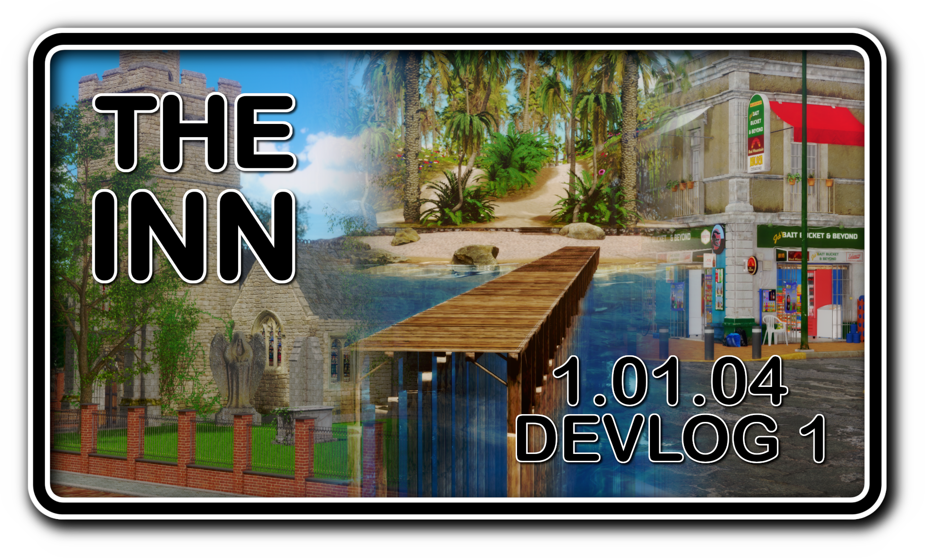
THE INN CH2 1.01.04 - DEVLOG 1!
 What's up, people?
October was a very busy month for The Inn's development. Most of it was spent porting new assets to create environments. This update includes three new environments, a record number for a single update.
If you know me, you know I don’t settle for basic assets. I always want to spruce things up and give them my own personal touch. Sometimes, that means I can get a bit obsessive and go overboard on the details. But in the end, it always pays off, and the environments end up looking gorgeous.
The three environments I worked on this time are a Church, a Beach, and a Commercial Strip for the town. In this devlog, I’d like to talk about each of them and share some insights into the creation process.
THE CHURCH

This was the first environment I worked on and, by far, the most complex, requiring the most retries, refits, and replanning of the three. If I recall correctly, I spent nearly an entire week working on it.
Like every environment in the game, the Church is designed to fit a wide variety of camera angles, so everything—from item placement to lighting—is created with flexibility in mind. The environment includes the main Church building, a small Mausoleum, and a Clergy House, which you can see behind the Mausoleum.
The hardest part was fitting the main building and the Clergy House into the same scene in a way that didn’t feel cramped. I also had to redo the small walkways—the ones with the lamp posts and benches—multiple times until I got a layout that worked well.
The Clergy House required additional work because, while the base model looked good, some elements couldn’t be removed with the tools available in Studio Neo. So, I had to make some edits in Blender.
After all that was done, I planned the lighting for the scene. As with all environments, I created five different lighting setups—one for each time of day. The evening and night scenes were the most challenging, as low-light settings can either look too dark or too bright, hiding details or overwhelming the scene. For those, I used a mix of point lights and emissive items to create a cozy atmosphere. Studio Neo’s point lights can be demanding on resources, so I'm glad I recently upgraded my GPU!
THE BEACH

This environment was the easiest of the bunch, taking about two days to complete, mostly spent on porting new assets. I did a lot of tinkering and added several tropical vegetation assets.
The base beach asset looked decent, but the vegetation was subpar. So, I removed the old vegetation and replaced it with high-quality assets, hand-placed one by one. The water is a separate item made with the Suimono plugin in Studio Neo, which looks much better than any other water asset I’ve found.
There isn’t much more to say about the beach—it was a straightforward process. Sometimes, less is more.
THE COMMERCIAL STRIP

This one wasn’t as complex as the Church but still took more effort than the Beach, mainly due to asset modification. It took about a week, mostly spent on tweaking textures.
The buildings I found were perfect for the small-town vibe I wanted to capture. They looked like the kind of buildings you’d see in a typical backwater town. Positioning them in the scene was easy; I just needed to focus on the streetlights and sidewalks, as most of the other details were high quality and needed little work.
The most time-consuming part was editing the textures. Many of the signs and text were in Spanish (the assets were probably designed for a Mexican-style town). I had to go through each texture with text on it, remove the Spanish lettering, and replace it with English text that fit the original aesthetic—around 50 textures in total! I could have left the text in Spanish, but it would have bothered me to have a town where everyone speaks English with signs in Spanish. That’s where my perfectionist side took over.
Aside from that, creating this environment was smooth sailing, and I’m really pleased with how it turned out.
FINAL THOUGHTS
Whew, that was a lot of work, right? With some time left over, I was also able to get some writing done. I think I’m about halfway through the dialogue for this update. There’s still plenty to do—scenes to create and code to write—but my goal is to release this update just in time for Christmas, so fingers crossed.
All in all, I think I did a pretty good job capturing the small-town vibe in these environments. I’d love to hear what you think!
Oh, one last thing—there won’t be any sneak peeks in this devlog because there aren’t any scenes to show yet.
That’s it for now. Have fun!
Get The Inn (NSFW Visual Novel)
The Inn (NSFW Visual Novel)
An erotic, comedic slice of life!
| Status | In development |
| Author | Lykanz |
| Genre | Visual Novel |
| Tags | Comedy, Dating Sim, Erotic, Funny, NSFW, Ren'Py, Romance, Singleplayer, Story Rich |
More posts
- THE INN CH2 1.02.01 - DEVLOG 2!Jul 29, 2025
- THE INN CH2 1.02.01 - DEVLOG 1!Jun 16, 2025
- THE INN CH2 - 1.01.05 PUBLIC RELEASE!May 13, 2025
- The Inn - Chapter 2 - 1.01.05 RELEASE DATES!Apr 12, 2025
- THE INN CH2 1.01.05 - DEVLOG 1!Mar 01, 2025
- THE INN CH2 - 1.01.04 PUBLIC RELEASE!Jan 16, 2025
- MERRY CHRISTMAS FROM THE INN!Dec 24, 2024
- The Inn - Chapter 2 - 1.01.04 RELEASE DATES!Dec 20, 2024
- THE INN CH2 1.01.04 - DEVLOG 2!Dec 01, 2024
Comments
Log in with itch.io to leave a comment.
Would have been funnier if u left the sings in spansish and it would be a detail that some players see and that Confuses them. And then they read this explanation. Could have been a funny moment.
Nice job on the new environments. They'll add a lot to the game.